


by Cullen Roche, Pragmatic Capitalism
The most difficult part about managing assets is the constant roller coaster ride of emotions. I don’t just carry the burden of my own emotions around with me. I have to be mindful of the emotions of every person I work with. It’s a lot to handle especially during times like these when the markets are so jittery and Greece and China appear to be blowing up around us.
That said, one of the hardest parts about investing is keeping these irrational fears in check. And yes, the vast majority of the time these fears turn out to be irrational. In my view, this appears to be one of those cases. Despite some worrying foreign trends I just don’t see much changing here at home in terms of the overall picture. As a case in point here are three broad macro data points that support this thinking.
1) Jobless Claims just keep on chugging (and by chugging, I mean plunging). Jobless claims have reached their lowest levels in over 40 years. This is one of the very best indicators of real-time economic data. Of course, one might be inclined to argue that jobless claims trough just when the economy is at its strongest. Yes, this is true, but here’s another fact – we have never had a recession in the USA without jobless claims spiking 20% year over year. Jobless claims are usually one of the first indicators to tell us we’re in a recession. The second, of course, is the NBER and they won’t let you know until about 6 months after claims do. As of now, claims are still declining at an annualized rate.

2) Cash levels point to a buying opportunity. Bank of America Merrill Lynch recently posted this indicator showing asset manager cash levels. Historically, when cash levels jump to 5.5% the market is consistent with extreme fear. The median return over a 1, 3, 6 and 12 month period is positive on average following such fear levels. Most impressively, the equity markets are up 16.8% on average one year later.
Of course, it’s pretty difficult to rely on historical indicators like this because each market cycle is always unique, but you know what they say – be fearful when others are greedy and be greedy when others are fearful. Now looks like one of those fearful times.

3) Is housing finally gaining some traction? The biggest reason this recovery has been so weak is due to the weak housing market. The stagnant recovery in housing has dragged down the entire economy for the last 7 years. But the housing data in the last few months has been rather robust. Here in California it feels like things are starting to really boom again. Rents are rising, new construction is everywhere, remodels are all over the place and housing starts are catching fire again. At a rate of 16.2% Q2 was one of the strongest quarters of the recovery.

If housing is starting to pick up momentum here we could enter the back half of 2015 having a mighty huge laugh at all the China and Greek worries.
***
* In fairness (and to challenge my own views) here are three bearish charts.
I promised I’d offer some bearish views after offering my bullish views yesterday. It’s always nice to challenge your own views so going through this was kind of a nice exercise. I hope these two posts offer some perspective.
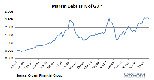
1) Margin Debt as a % of GDP is back at dangerous levels. We know that debt can be an extremely dangerous component of any economic boom. After all, it’s usually the excesses of the boom that lead to the bust. And debt is usually that fuel. Margin debt is now back to levels that we saw back when the markets peaked in 2000 and 2007.
Of course, debt doesn’t necessarily mean that the market isn’t about to turn over. I prefer to think of margin debt as a sign that the risks are higher today. That is, if and when the market tumbles the deleveraging of the debt can contribute to the downside in a manner that otherwise wouldn’t occur.
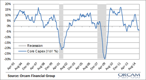
2) Core Capex has Turned Negative. One of the primary causes of the weak recovery has been low levels of corporate investment. The durable goods report from earlier this week showed continuing low levels of new orders. The core capex rate is now negative at a rate of almost 5% year over year. Historically, durable goods orders have tended to correlate highly with the stock market and recessions so this certainly isn’t something that makes me feel terribly comfortable.
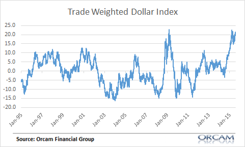
3) The Dollar Surge is a Sign of Emerging Market Troubles. A strong dollar doesn’t worry me, but a dollar that is THIS strong is a sign that something worrisome could be going on. Historically, substantial year over year increases in the dollar have been consistent with a flight to safety. With the recent European and Emerging Market turmoil we’re seeing huge demand for dollars as a good deal of foreign debt is dollar denominated. The current surge in the dollar is a sign that there’s a flight to safety occurring and more turmoil in the financial markets than many might presume.
Copyright © Cullen Roche, Pragmatic Capitalism