

by James Picerno, The Capital Spectator
The US stock market is nothing if not resilient. There’s no shortage of risks lurking around the world, but the American equity market shows minimal signs of relinquishing its role as the leading performer among the major asset classes. Sure, the bears mount a challenge every so often (including last week’s selloff), but any setbacks have been temporary affairs… so far. Indeed, the bulls took control again yesterday and stocks mounted a modest recovery.
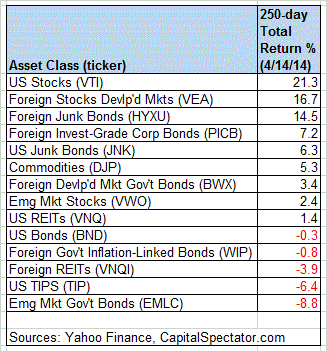
The numbers, as usual, tell the story. Using our standard list of ETF proxies, via a 250-trading-day window (the rough equivalent of 1-year returns), a broad measure of US stocks (VTI) is higher by more than 21%. Meanwhile, government bonds in emerging markets (EMLC) continue to sit at the bottom of the performance ledger for the trailing 250-day period.
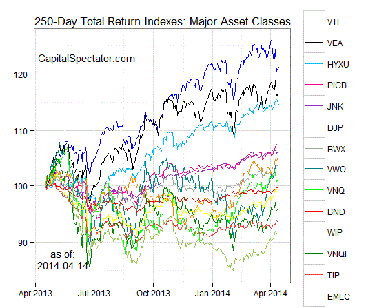
For another view, here’s how the numbers stack up with a graphical summary of the relative performance histories for each of the major asset classes for the past 250 trading days by way of the ETF proxies. The chart below shows the performance records through April 14, 2014, with all the ETFs rebased to 100 based on a start date of April 17, 2013:
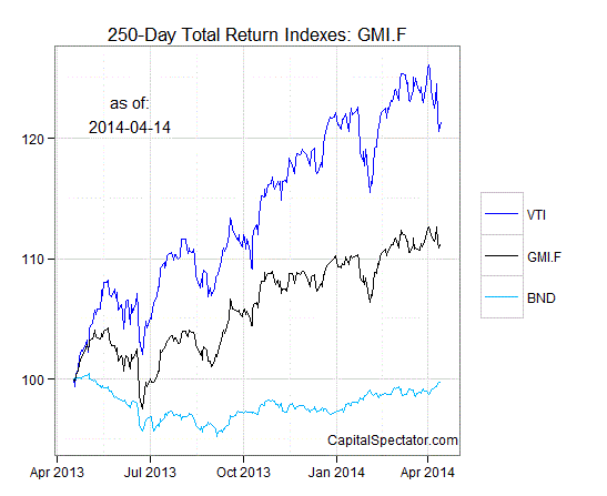
Now let’s consider an ETF-based version of a passive, market-value-weighted mix of all the major asset classes–the Global Market Index Fund, or GMI.F, which is comprised of all the ETFs in the table above. Here’s how GMI.F stacks up for the past 250 trading days through April 14, 2014. This investable strategy is higher by 11.2% across that span of time, or roughly midway between the returns for US stocks (VTI) and US bonds (BND) over the same period.
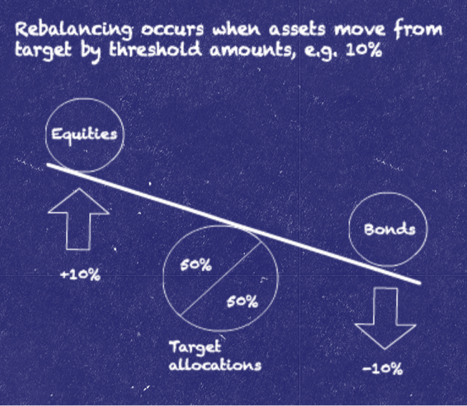
Comparing the overall dispersion of returns for the major asset classes via ETFs suggests that the rebalancing opportunity is relatively low for GMI.F overall vs. recent history. Analyzing the components of GMI.F with a rolling median absolute deviation of one-year returns for all the funds–the GMI.F Rebalancing Opportunity Index, as it’s labeled on these pages–suggests that there’s minimal potential generally for adding value by reweighting this portfolio in comparison with the past 12 months. Keep in mind that the opportunity for productive rebalancing will vary depending on the choice of holdings and historical time window. Meantime, don’t overlook the possibility that any given pair of ETFs may present a substantially greater or lesser degree of rebalancing opportunity vs. analyzing GMI.F’s components collectively.
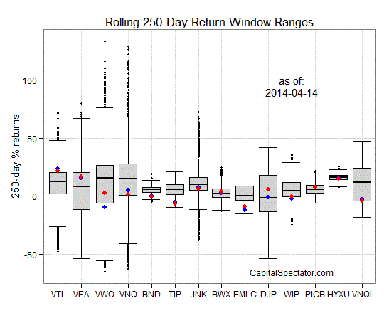
Finally, let’s compare the rolling 1-year returns (250-trading-day performance) for the ETFs in GMI.F via boxplots for a revealing comparison of price momentum across the board. The gray boxes in the chart below reflect the middle range of historical 250-day returns for each ETF—the 25th to 75th return percentiles. The red dots show the current return (as of April 14) vs. the 250-day return from 30 trading days earlier (blue dots, which may be hiding behind the red dots in some cases). Note that most of the asset classes are posting relatively high or comparable 250-day trailing returns vs. the numbers from 30 days earlier.