


Horace, the Roman poet of the first century BCE wrote in his work Ars Poetica "many shall be restored that are now fallen and many shall fall that are now in honor." We can say with absolute certainty that Horace was not referring to modern day North American real estate markets, however, his statement appropriately captures the essence of the current Canadian and US economic landscape.
US Recovery, Canadian Weakness
by Pacifica Partners Capital Management
On many levels an economic mean-reversion is taking place as a decade long bull-market in Canadian real estate has now stalled, coinciding with other faltering drivers of the Canadian economy. Meanwhile, the US housing market has surged 8% higher in the last year and cities such as Phoenix Arizona have risen over 25%. This recovery has emerged after a six-year US real estate drudging that has left in its wake systemically high US unemployment and a global economic dependence on central bank-sponsored stimulus.
Unlike with the US, Canadian markets are undergoing a period of price weakness; home prices in major markets of Toronto, Montreal, Vancouver, and Calgary are all lower from their all-time highs as the chart below illustrates. Notably, Canada’s three largest cities, Vancouver, Toronto, and Montreal are only into the first year of a potential lengthy period of price weakness.
However, even these early signs of weakness are significant because they are being accompanied by a systemic "drying up" of home sales volume. In some markets the volume drought has been large in magnitude. Vancouver in particular experienced April 2013 sales which were the lowest April sales since 2001, or 20.9% below the ten-year April average (Vancouver Sun). This reduction in sales volume is not just in Vancouver. The Canadian Real Estate Association (CREA) reported 90 percent of the local markets that it monitors posting year-over-year March sales declines (BNN). Why is the volume of home sales important? Sales volume contraction is often a precursor to price declines within any asset class, and particularly so in housing. We examined this fact in our previous chartbook publication by examining US housing sales volume changes leading up to the US housing crash (Chartbook Dec 2012).
Chart 1)-new
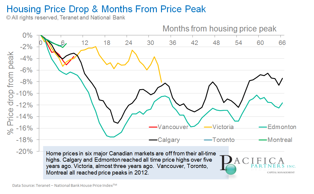
Click Here to view a larger version of this diagram
In addition to the sales volume drought, average home prices are also exhibiting weaknesses. In Vancouver, widely considered Canada’s "bubbliest" city, average single family home sale prices are down over 14% from their highs and average condo prices are close to 2007 levels (Brian Ripley’s CHPC).
The decade long shift in leadership between Canadian and US housing prices is best observed through our charts on relative US/Canadian housing markets (Section D– chart library). Canadian markets of Vancouver, Toronto, and Montreal have now all reversed bullish trends versus US markets which had been in place since December of 2005 (See Vancouver Chart below). The only major exception is Calgary, where home prices have continued their sideways move relative to US home prices which began in 2009.
Chart 2)
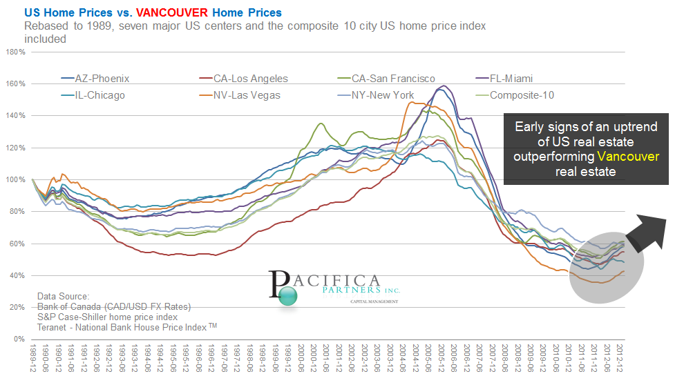
Click Here to view a larger version of this diagram
Leading indicators of the economy
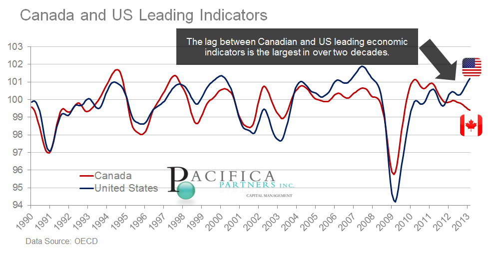
The strength of the US and weakness of Canada is not confined to real estate markets. Since our last update to the Canadian Real Estate Chartbook in December 2012, a pronounced shift in both Canadian and US economies has taken place. The Canadian economy, once the envy of Americans, Europeans, and others, is now widely viewed as a commodity dependent, “one trick pony”.
Nothing better illustrates the economic differential than the OECD’s leading economic indicators, which we first cited in our Winter 2013 newsletter and are updated below. Canadian leading economic indicators are now falling behind US leading indicators by the widest margin in over two decades.
Chart 3)-new
Click Here to view a larger version of this diagram
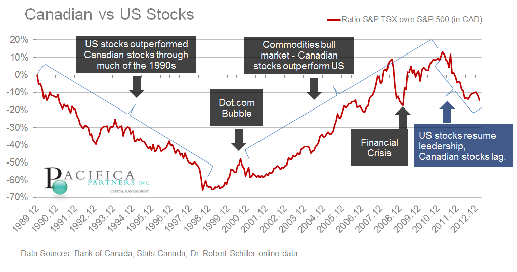
Stock markets, which are themselves a leading indicator of the future state of the economy, have also diverged from one another. The Canadian market and its foremost index, the S&P TSX composite, has lagged its US counterpart the, S&P 500, for the better part of two years. In the interest of brevity we direct readers interested in a more detailed explanation of the divergence to our recently published Spring 2013 newsletter. Alternatively, the following chart is presented below illustrating the extent of the recent Canadian underperformance. This ominous pattern could foreseeably continue should drivers of the Canadian stock market, notably global commodity demand, continue to weaken.
Chart 4)-new
Click Here to view a larger version of this diagram The leading economic indicator which gives the most reason for pause is the slowing new Canadian home starts, which are now declining on a year-over-year basis and doing so at the fastest rate since the financial crisis (see below). Bank of Montreal economist Sal Guatieri recently addressed this fact by stating, “Canadian home builders are facing the new reality that the decade-long housing boom has ended" (Globe and Mail). With 20% of Canadian GDP directly involved in construction and real estate activities, a continued slowdown in housing-starts will have a marked impact on the consumer behavior and ripple through other consumer sensitive areas of the economy, including retail sales, financial services, transportation, and warehousing.
Chart 5)-new
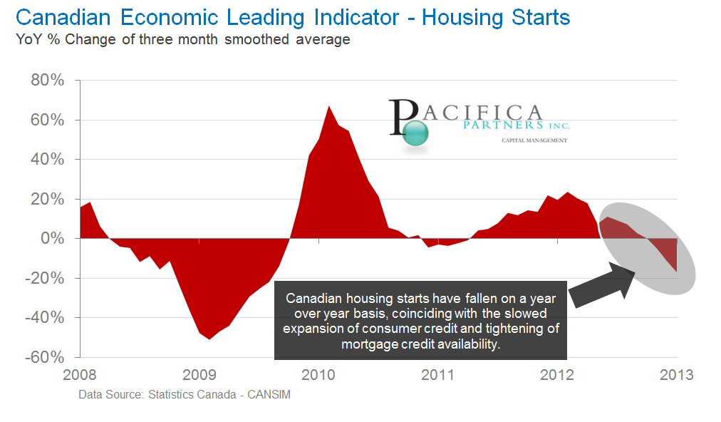
Click Here to view a larger version of this diagram
Lacking confidence
As a consumer-driven asset class, real estate is intimately tied to domestic consumer outlook. Due to this, it is important to note that Canadian consumer confidence has slid stealthily lower since peaking in early 2010. In fact, consumer confidence is now approaching the same levels last seen immediately following the financial crisis! (see chart below).
Chart 6)-new
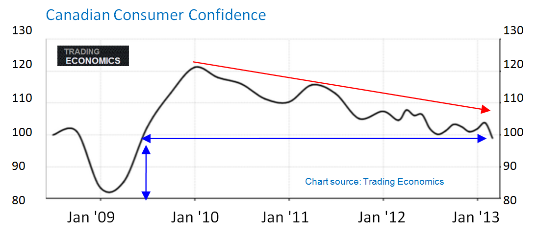
Click Here to view a larger version of this diagram. Chart Source Trading Economics Adding to the decline in consumer confidence are recent employment numbers that indicate private Canadian companies, those most indicative of overall economic health, shed 105,400 jobs in March and April 2013. This number of private sector job loss again mimics the numbers last witnessed during the financial crisis.
The weakness in the Canadian job market may come as a surprise to some readers as news headlines often indicate a reduction in the unemployment rate. The unemployment rate has been on a downward trend since the end of the recession, however, it has stubbornly failed to fall below 7%. This is in comparison to the sub 6% unemployment rates seen in Canada before the recession.
In addition, the overall unemployment rate does not always capture the true inherent weakness in the employment environment due to the often misleading inclusion of individuals indicating their status as “self-employed”. Chief economist of Gluskin Sheff, David Rosenberg, recently commented on the significance of swelling US self-employed ranks by stating, the self-employed are, “…consultants working out of their basement offices and not exactly picking up much business…“ (Barrons). Thus the loss of private sector jobs is a critical weakness in the Canadian economy also voice by Benoit Durocher, senior economist of Desjardins Securities, “The replacement of private-sector jobs with independent work is usually not a sign of a healthy labour market.” Globe and Mail
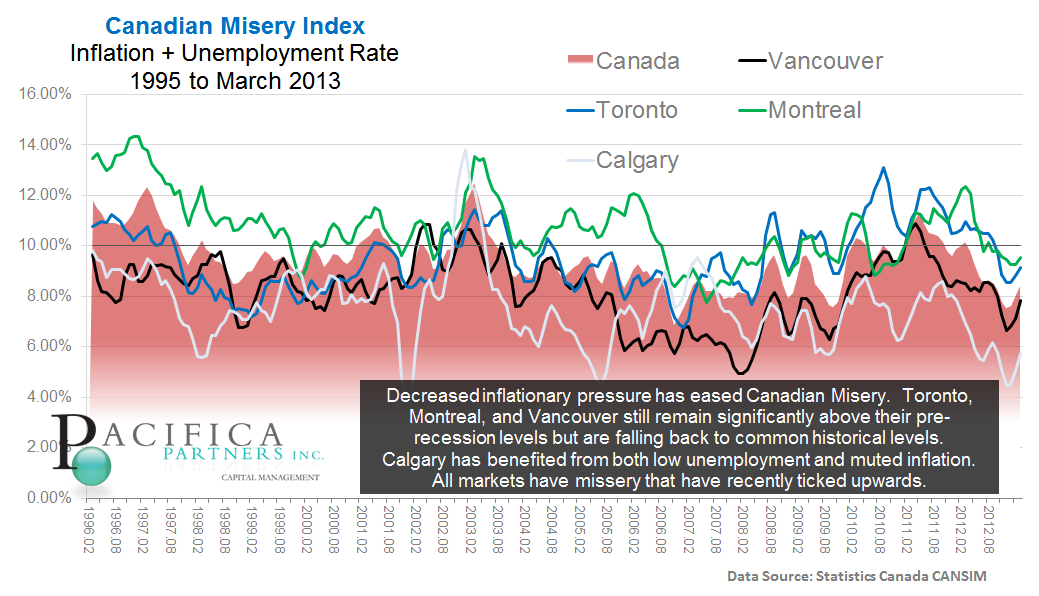
These findings on unemployment are echoed in Canadian "Misery Index" (inflation + unemployment rates), as illustrated below. All major markets are signaling upticks in misery. Toronto, Montreal, and Vancouver are exhibiting it above pre-recession lows, this despite barely-existent inflation and employment numbers that are likely understating reality.
Chart 7)
Click Here to view a larger version of this diagram
Debt burdens
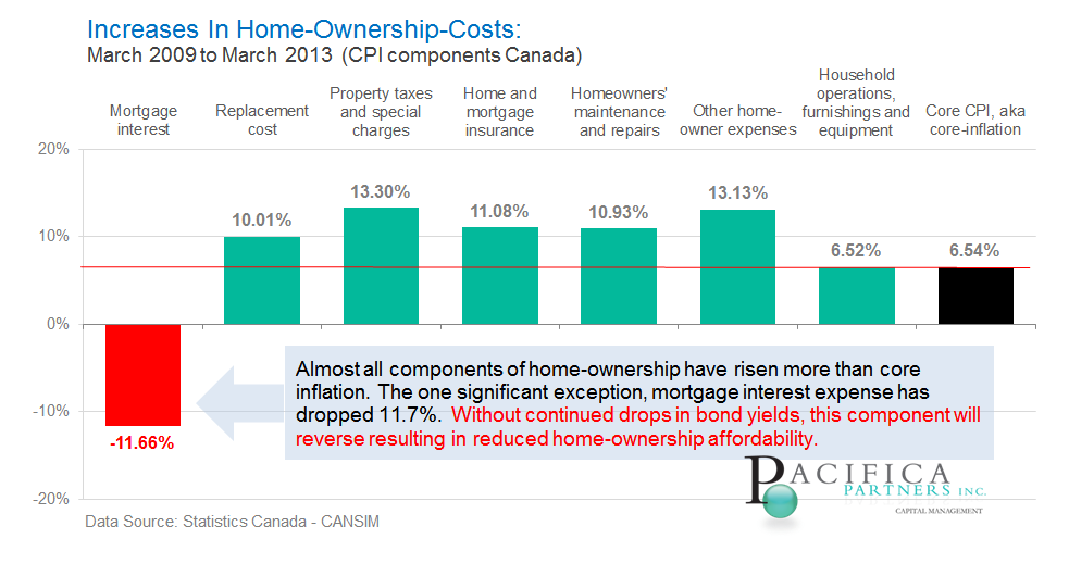
We reiterate our belief that the Canadian housing bull market of the last decade has been primarily driven by credit expansion, a.k.a. increased debt levels by Canadians. Readers are directed to Chart A2 in the chart library for support of this belief. The desire for Canadians to take on more debt and thus more risk has largely been due to low interest rates which now stand at a generational low of less than 2% as indicated by 10 year government of Canada bonds. These low rates have allowed for enhanced cash-flow-affordability (not to be mistaken with actual affordability) as home owners' monthly mortgage interest expense has declined by - over 11% since 2009. Notably, all other major components of home ownership costs including replacement costs, property taxes, insurance, maintenance, furnishings, and miscellaneous expenses have grown at least as must as Canadian core inflation and in some cases more than twice as much! (See below)
Chart 8)-new
Click Here to view a larger version of this diagram How large has the outstanding mortgage and consumer debt grown to? Statistics Canada reported that in the final quarter of 2012 the average Canadian household owed $164.97 in debt for every $100 of disposable, after-tax income. In total, Canadian households now hold a combined $1.1 trillion of mortgage debt and $477 billion of consumer debt (Huffington Post). To put this number into perspective, it is a large enough sum to purchase every single publicly traded stock share listed on either the Australian stock exchange (ASX), or the SIX Swiss Exchange, or even the Deutsche Börse of Germany. The size of this debt relative to the entire Canadian economy (GDP) and its progression over time is illustrated below. Canadian debt levels relative to GDP appeared to have now stalled near the 90% levels and the growth rate is far below the heady days witnessed prior to 2010.
Chart 9)
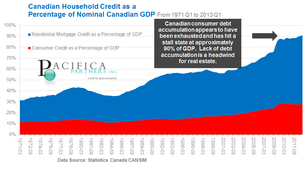
Click Here to view a larger version of this diagram
An important finding that emerged recently is that Canadian debt burdens are not largely borne by young first-time home owners desperate to get into the housing market and thus overpaying and overleveraging themselves. In fact, bankruptcy trustees Hoyes, Michalos & Associates were recently cited in a study finding that the highest debt levels occur in the 50 to 59 year old age demographic. As one trustee at the firm stated, “At a time in their lives when they should be rapidly paying down debt, their financial burden continues to grow.” (Canada Newswire) This finding further identifies limitations on future credit expansion and emphasizes the impact that demographic challenges will have on Canadian real estate. Effectively, debt-burdened Canadians approaching or entering retirement will be more reliant on wealth currently locked in the form of home-equity. We touched on the role of Canadian demographics in real estate valuation in our last chartbook (Chartbook Dec 2012)
Canadian consumer debt burdens and the dependence on it by the domestic economy and real estate are best summarized by the Bank of Canada itself: "These measures [tightening government-insured mortgage lending standards] reduce the number one risk... to the Canadian economy," - Former Governor of the Bank of Canada Mark Carney, June 21 2012 Reuters
The slowdown
The economic slowdown in Canada is difficult to ignore - the International Monetary Fund (IMF) cut its growth outlook for Canada's economy to 1.5% from 1.8%, the weakest growth rate since the financial crisis (Globe and Mail). The Bank of Canada itself also cut domestic growth estimates in April while indicating emergency-level low interest rates would persist (Maclean’s). Despite low rates, the net result of such events is likely a headwind for Canadian real estate markets. Sustained weakness in the economy will only serve to burden Canadian consumers further. In addition, Canadian consumers have already extrapolated the persistence of low interest rates further into the future than the Bank of Canada. In other words, consumers have already reflected a prolonged low rate environment into home price valuations.
Words of the wise
A portion of our last commentary was dedicated to a summary of policy errors that led up to the current state of excessive Canadian mortgage debt. Recent tightening by the Finance Minister on lending standards, although generally considered prudent, has been lobbied against by those in the lending industry. The question now emerges: Will Canadian Finance Minister, Jim Flaherty, reverse course on last year’s mortgage tightening in the face of a weakening Canadian economy? If his future actions are consistent with recent statements made in Britain to the G7 finance ministers, then the answer is “no”. Minister Flaherty was vocal in indicating that the lack of resolve by other G7 finance ministers to stick with debt reducing austerity measures was an error. (Reuters)
At this latest G7 meeting, not only did Minister Flaherty provide insight on his conviction to stick to austerity despite the economic hardships that it creates, he also shed light on how Canadian policy makers truly viewed the Canadian housing market prior to the latest round of tightening. "We are seeing moderation in the Canadian housing market. We did not have a bubble, but we had the beginnings of the indications of a bubble." - Jim Flaherty (Reuters). Readers are reminded that any stronger statement as to the existence of a bubble would be unlikely since it is common practice for policy makers to attempt to "talk down" fears.
Summary
We remain bearish on the Canadian real estate market with real estate appearing overvalued by approximately 30% in most major markets (See table). Canadian economic weakness, the expected contraction of outstanding consumer credit, and already heightened real estate prices serve as the basis for our bearish stance.
An update of this chartbook will be made available in October/November 2013.
All charts not referenced above are included below: Due to changes with Google trends data, the housing bubble sentiment grid has been discontinued.
Section A: Economics
Chart A1) Wages vs. Home Price Growth Chart A2) Canadian GDP, Home Prices, and Outstanding Mortgage Credit Chart A3) Population Growth and Housing Capacity Chart A4) Consumer Credit Growth
Section B: Valuation
Chart B1) Home Prices over Present Value of Rents Chart Table B1) Home Prices over Present Value of Rents Table Chart B2) Home Prices to Rents
Section C: Real Index Values
Chart C1) Canadian Real Rent Index Chart C2) Canadian Real Home Price Index
Section D: Canadian versus US Real Estate
Chart D1) US Home Prices vs Vancouver Home Prices - Presented above in report Chart D3) US Home Prices vs Toronto Home Prices Chart D4) US Home Prices vs Montreal Home Prices Chart D5) US Home Prices vs Calgary Home Prices
Section E: City Summaries, Home Price QoQ change, Inflation, Unemployment
Chart E1) Vancouver Chart E2) Edmonton Chart E3) Calgary Chart E4) Winnipeg Chart E5) Toronto Chart E6) Ottawa Chart E7) Montreal Chart E8) Halifax
Section F: Home Price and Sales Pair Volume Change for Major Canadian Cities
Chart F1) Canada Chart F2) Vancouver Chart F3) Calgary Chart F4) Toronto Chart F5) Ottawa Chart F6) Montreal Chart F7) Halifax
Section G: Stocks vs Real Estate
Chart G1) Canadian Stocks vs Canadian Real Estate (Long Term) Chart G2) Canadian Stocks vs Canadian Real Estate (Medium Term) Chart G3) US Stocks vs US Real Estate (Long Term) Chart G4) US Stocks vs US Real Estate (Medium Term)
Section A) Economics Return to Library
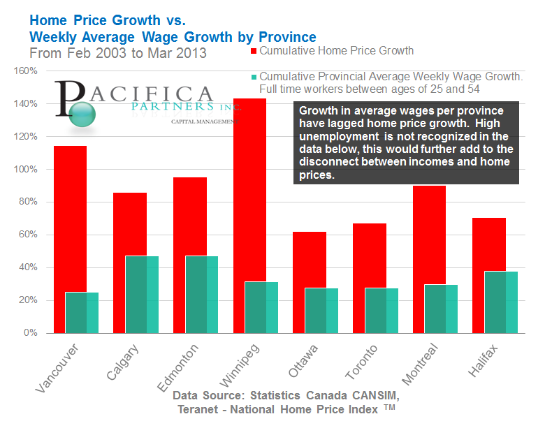
Chart A1) Wages vs. Home Price Growth
Canadian wage growth versus home price appreciation from Feb 2003 to Mar 2013 is reported below. Average weekly wage growth per home province of each city is reported. Also, only wages of full time workers between the ages of 25 and 54 were examined in an attempt to capture changes to the buying power potential of first-time-homebuyers. In all ten markets examined, home price appreciation far surpassed average weekly wage growth.
Click Here to view a larger version of this diagram
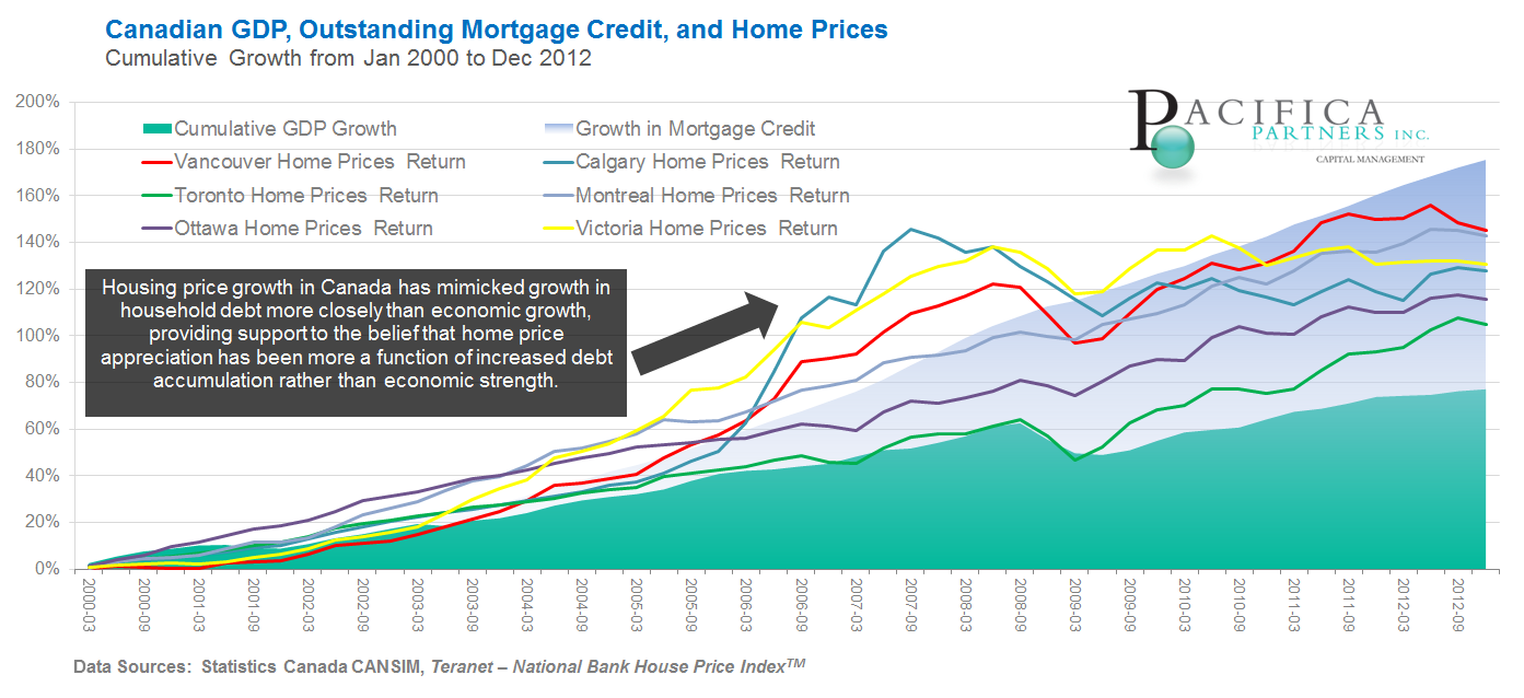
Chart A2) Canadian GDP, Home Prices, and Outstanding Mortgage Credit
Appreciation in Canadian home prices (from January 2000 onward) has more closely reflected growth in mortgage credit rather than growth in Canadian nominal GDP.
Click Here to view a larger version of this diagram
Chart A3) Population Growth and Housing Capacity
In all major Canadian housing markets housing capacity growth has exceeded population increases between 2002 and March 2013. Calgary, Edmonton, Ottawa, Montreal and Halifax are what we would consider to be "severely overbuilt" with excess housing capacity of roughly 50% or more than population growth over the same period. Vancouver, Toronto, and Winnipeg, are "overbuilt" with excess housing capacity close to 20% more than population growth over the examined period.
Housing capacity is defined as the number of individuals that can be reasonably housed in new housing units, whether or not a new housing unit sits unoccupied, under-occupied, or over-occupied. Assumptions made may be more appropriate for some markets over others. 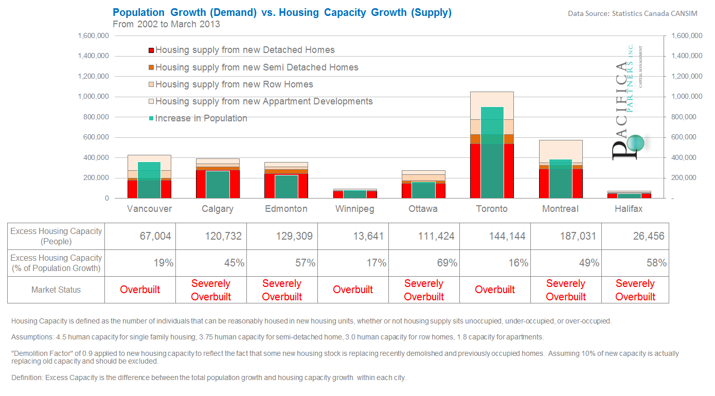
Click Here to view a larger version of this diagram
Chart A4) Consumer Credit Growth
Despite falling interest rates, Canadian consumer credit growth has slowed to the lowest levels in more than 12 years. This observation is despite the fact that real bond yields, or inflation adjusted yields, have dropped significantly. The axis on the right in red tracks 3 to 5 year real Canadian government bond yields which are now below zero. In other words, interest income on these bonds are no longer sufficient to overcome lost purchasing power from the effects of inflation. Should consumer and mortgage credit begin to contract then this will serve as a major headwind to future real estate appreciation.

Click Here to view a larger version of this diagram
Section B) Valuation Return to Library
Chart B1) Home Prices over Present Value of Rents In theory, residential real estate prices should equal the discounted sum of future rental income. As a result, we have attempted to estimate fair values for residential real estate in major cities by comparing actual prices to theoretical discounted prices (valuation ratio). In theory, this ratio should equal one and deviations from this value should regress back to the value one over time. Note, discounted cash flow calculations are highly volatile and dependent on underlying model assumptions. However based off of this methodology, Canadian real estate appears extremely expensive in most major markets. Canadian real estate only appears somewhat reasonably priced if the assumption that current emergency low interest rates continue indefinitely into the future. Any increase in interest rates to even pre recession levels (which were also historically low) causes Canadian real estate as a whole to appear grossly overvalued.
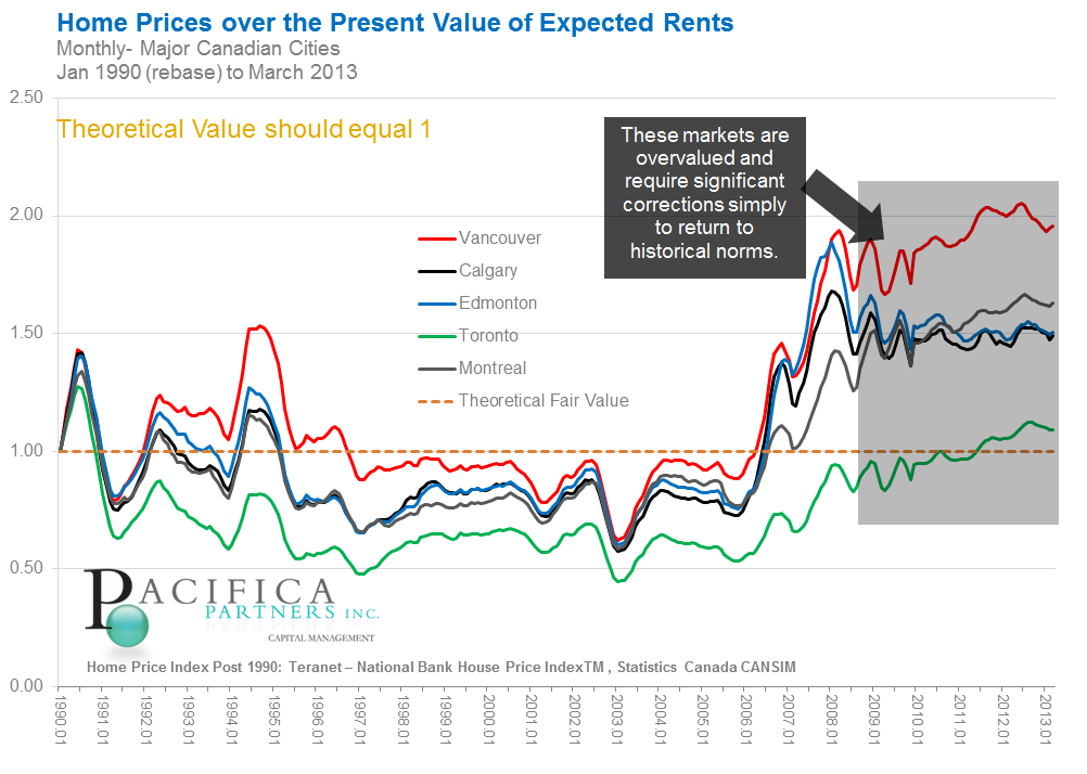
Click Here to view a larger version of this diagram
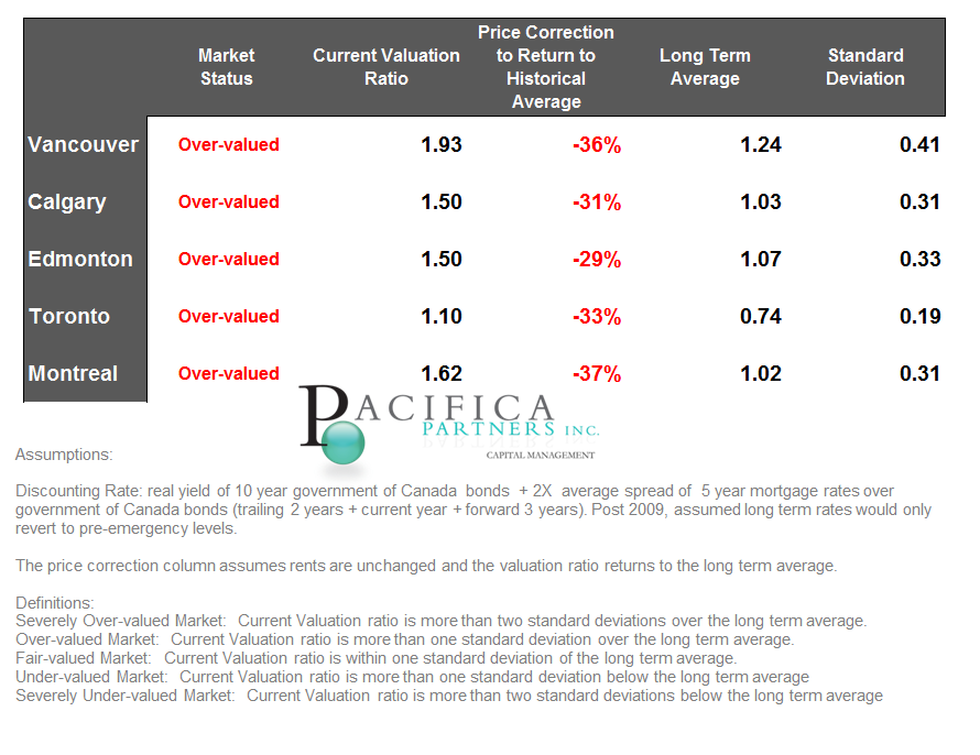
Table B1) Home Prices over Present Value of Rents
Using the data from Chart B1 above, the following table attempts to quantify the degree of price correction necessary to return the valuation ratio in these five real estate markets back to the historical average valuation ratio. The price corrections necessary to return the valuation ratio to the historical moving average range from -39% in Montreal, to -31% in Edmonton.
Click Here to view a larger version of this diagram
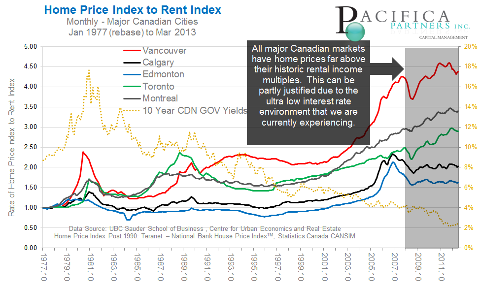
Chart B3) Home Prices to Rents
Canadian home prices are currently not in line with historic multiples of residential rental prices. Most extended from historical norms are Vancouver, Montreal, and Toronto. While Edmonton and Calgary, are elevated from historic averages but below previous witnessed highs.
Click Here to view a larger version of this diagram
Section C) Real Index Values Return to Library
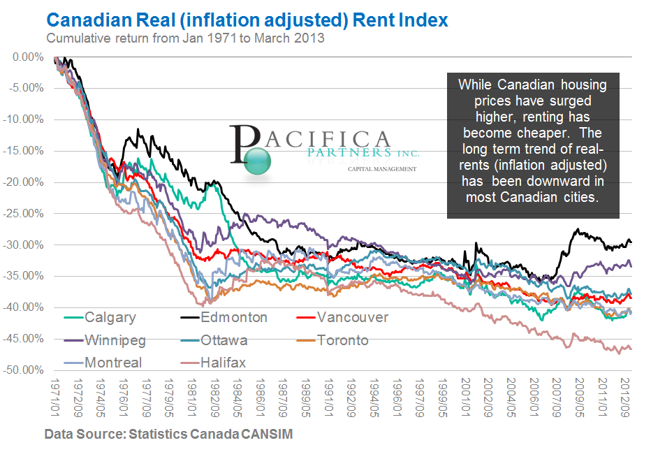
Chart C1) Canadian Real Rent Index
Canadian residential rent increases have not historically kept pace with inflation. While Canadian housing prices have surged higher, renting has become relatively cheaper. This is evident from the chart below indicating long term trend of real-rents (inflation adjusted) has been downward in most Canadian cities. This has implications for retirees expecting to utilize rental income to finance long term retirement expenditures. As with non inflation indexed bonds, cash flows from Canadian real estate may prove to be ineffective to satisfy future increases in the cost of living. This is in addition to the fact that residential real estate in Canada already possess low rental yields, or the net annual rental income generated from a property dividend by the current market value of the property.
Click Hereto view a larger version of this diagram
Chart C2) Canadian Real Home Price Index
Long term real (inflation adjusted) annual home price returns have exceeded 3% in Vancouver and Victoria BC, while exceeding 1.5% in most other large Canadian cities. Edmonton is the only exception with a compounded annual house price appreciation of 0.64% over the examined period. To put this into perspective, numerous examinations of long term real US home price appreciation indicate that they have only slightly exceeded inflation at an approximate annual compounded rate of 0.5% per year.
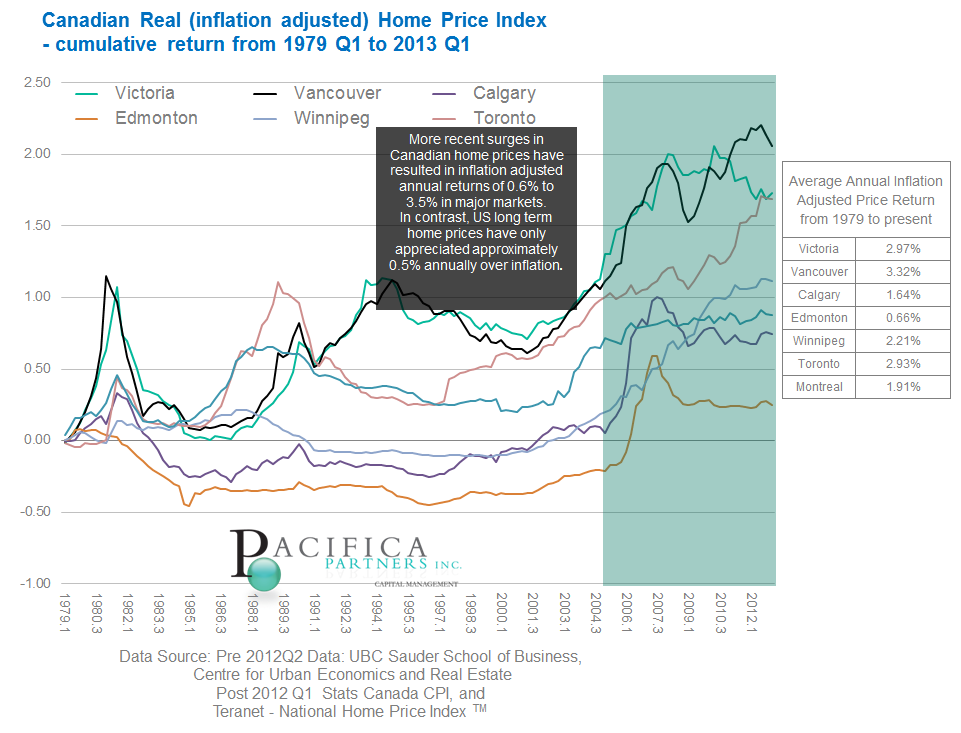
Click Here to view a larger version of this diagram
Section D) Canadian versus US Real Estate Return to Library
Chart D2) US Home Prices vs Toronto Home Prices
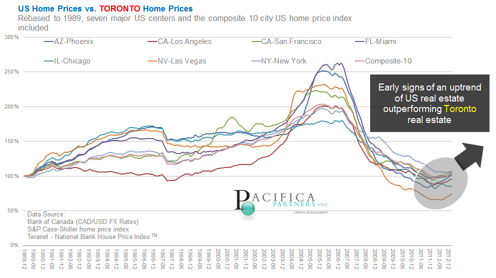
Click Here to view a larger version of this diagram
Chart D3) US Home Prices vs Montreal Home Prices
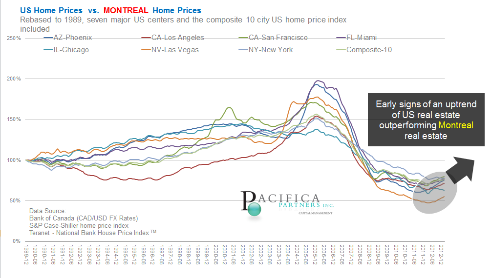
Click Here to view a larger version of this diagram
Chart D4) US Home Prices vs Calgary Home Prices
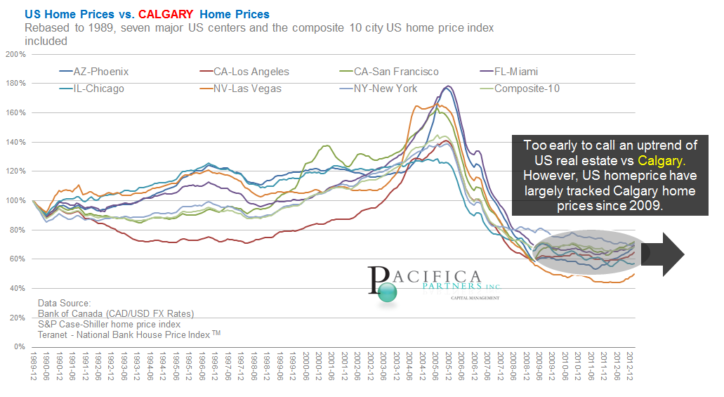
Click Here to view a larger version of this diagram
Section E) Canadian City SummariesReturn to Library
The following charts display a time series of unemployment, vacancy rates, and quarterly home price changes for: Vancouver, Calgary, Edmonton, Winnipeg, Ottawa, Toronto, Montreal, and Halifax.
Chart E1) Vancouver
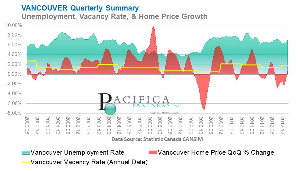
Click Here to view a larger version of this diagram
Chart E2) Edmonton
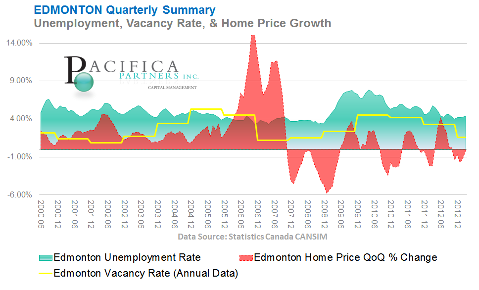
Click Here to view a larger version of this diagram
Chart E3) Calgary
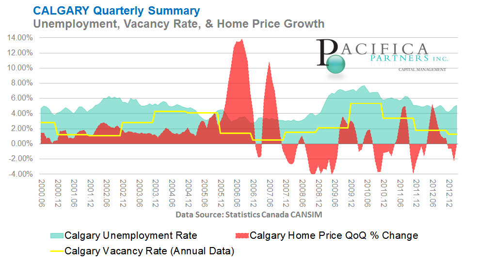
Click Here to view a larger version of this diagram
Chart E4) Winnipeg
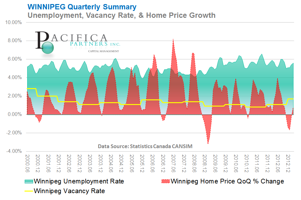
Click Here to view a larger version of this diagram
Chart E5) Toronto
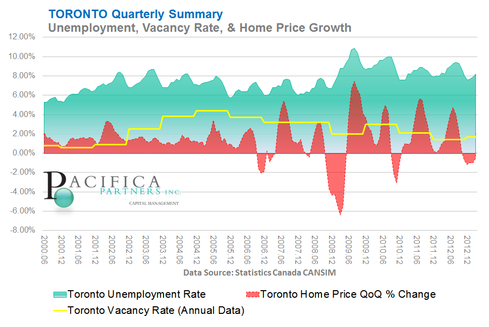
Click Here to view a larger version of this diagram
Chart E6) Ottawa
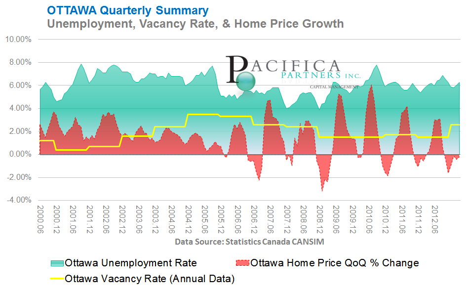
Click Here to view a larger version of this diagram
Chart E7) Montreal
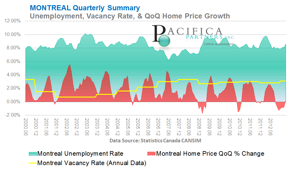
Click Here to view a larger version of this diagram
Chart E8) Halifax
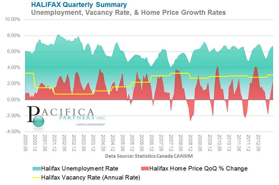
Click Here to view a larger version of this diagram
Section F) Home Price and Sales Pair Volume Change for Major Canadian Cities Return to Library
The following charts indicate annual changes in monthly home prices and "sales pair" volume. Data has been generously made available by Teranet - National Bank for: Canada, Vancouver, Calgary, Ottawa, Toronto, Montreal, and Halifax. Please visit http://www.housepriceindex.ca/ for the definitions and methodologies used calculating their indices.
Chart F1) Canada
Click Here to view a larger version of this diagram
Chart F2) Vancouver
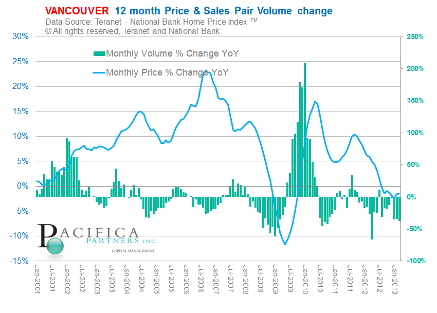
Click Here to view a larger version of this diagram
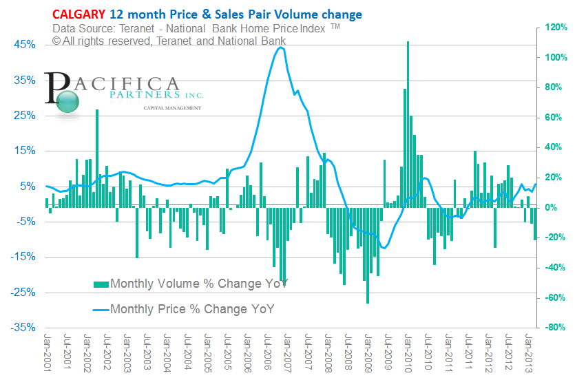
Chart F3) Calgary
Click Here to view a larger version of this diagram
Chart F4) Toronto
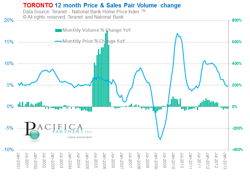
Click Here to view a larger version of this diagram
Chart F5) Ottawa
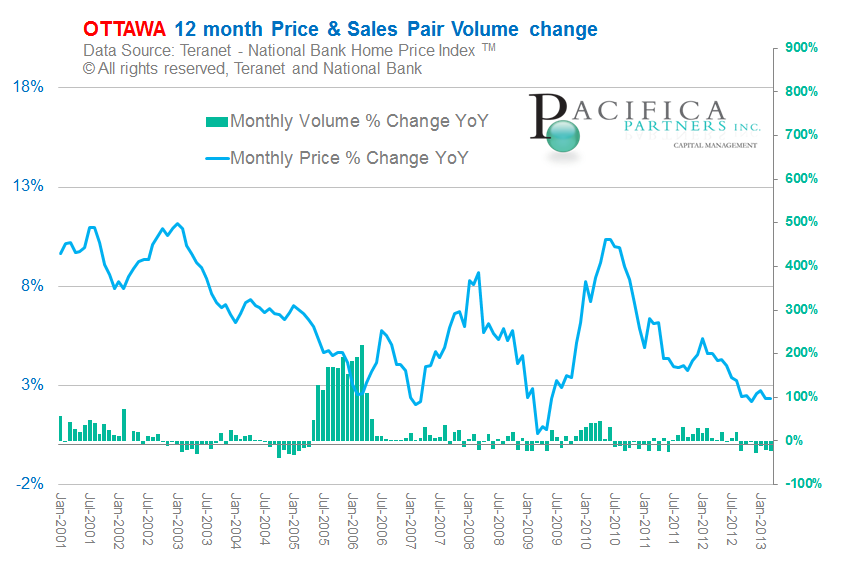
Click Here to view a larger version of this diagram
Chart F6) Montreal
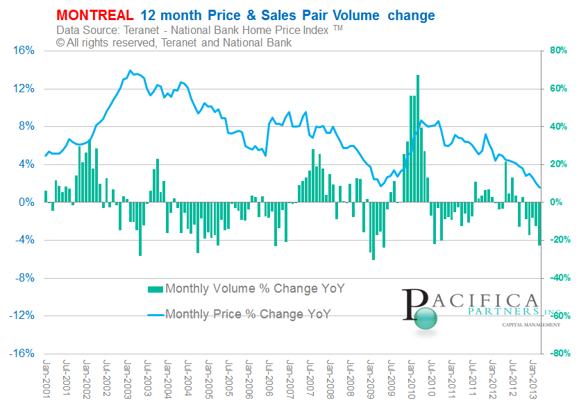
Click Here to view a larger version of this diagram
Chart F7) Halifax
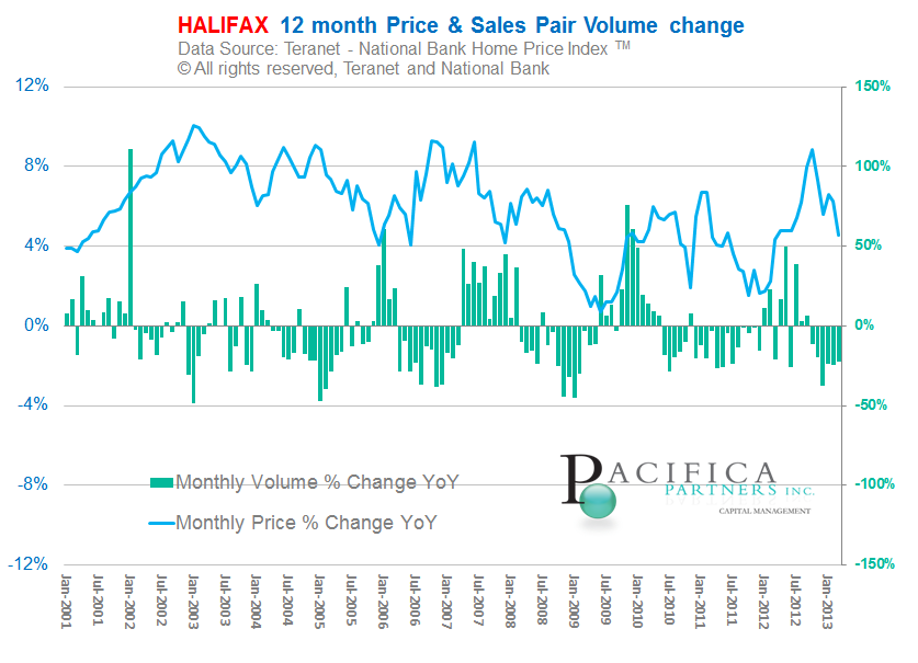
Click Here to view a larger version of this diagram
Section G) Stocks versus Real Estate Return to Library
Canadian Real Estate versus Canadian Stocks (S&P TSX Index)
US Real Estate versus US Stocks (S&P 500 Index)
Chart G1) Canadian Stocks vs. Canadian Real Estate (Long Term)
Displayed in the chart below are Canadian home prices as a ratio of the TSX index (Canadian stock market) from 1977. Seven cities are included: Vancouver, Victoria, Calgary, Edmonton, Regina, Toronto, and Montreal. Over the long term, home prices in Canada have lagged price appreciation of stocks. Note, the stock index below is a "price index" and therefore, excludes payment of dividends.
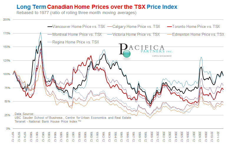
Click Here to view a larger version of this diagram
Chart G2) Canadian Stocks vs. Canadian Real Estate (Medium Term)
Displayed in the chart below are Canadian home prices as a ratio of the TSX index (Canadian stock market) from 1998. Nine cities are included: Vancouver, Victoria, Calgary, Edmonton, Regina, Ottawa, Toronto, Montrea, and Halifaxl. Over the long term, home prices in Canada have lagged price appreciation of stocks. Note, the stock index below is a "price index" and therefore, excludes payment of dividends.
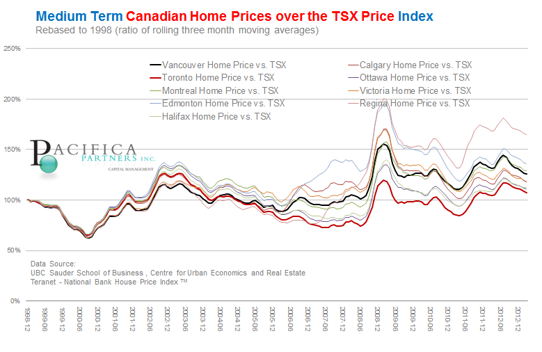
Click Here to view a larger version of this diagram
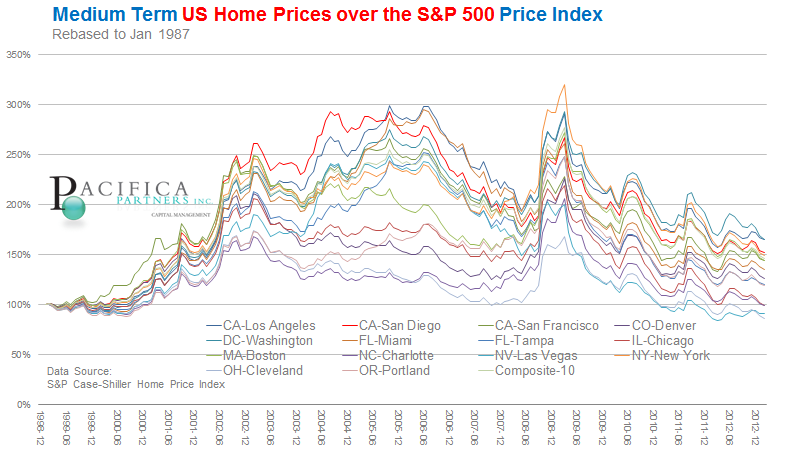
Chart G3) US Stocks vs US Real Estate (Long Term)
For comparison purposes the following two charts (Chart G3 and Chart G4) have also been included which display US home prices as a multiple of the S&P 500 (US stock market). The chart immediately below displays US home prices as a ratio of the S&P 500 index (US stock market) from 1987 onward. Fourteen US cities are included in the chart below as well as a composite index of ten major US Cities. Over the medium term, home prices in Canada have outperformed price appreciation of stocks. Note, the spike on the charts observed at March 2009 represent the stock market bottom during the financial crisis.
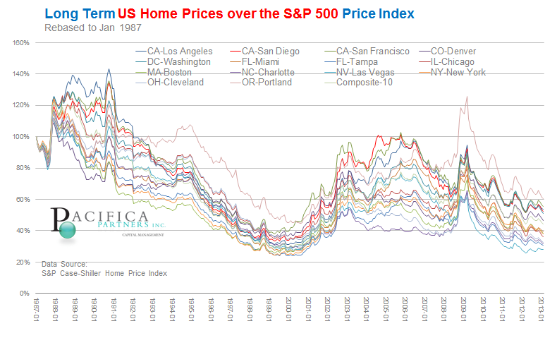
Click Here to view a larger version of this diagram
Chart G4) US Stocks vs US Real Estate (Medium Term)
Click Here to view a larger version of this diagram
Thank you to the following data providers:
Teranet-National Bank Statistics Canada Standard & Poor's Trading Economics OECD Bank of Canada Dr. Robert J. Shiller

Pacifica Partners Inc. - Capital Management

This report is for information purposes only and is neither a solicitation for the purchase of securities nor an offer of securities. The information contained in this report has been compiled from sources we believe to be reliable, however, we make no guarantee, representation or warranty, expressed or implied, as to such information’s accuracy or completeness. All opinions and estimates contained in this report, whether or not our own, are based on assumptions we believe to be reasonable as of the date of the report and are subject to change without notice. Past performance is not indicative of future performance. Please note that, as at the date of this report, our firm may hold positions in some of the companies mentioned.
Social Media: It is Pacifica Partners Inc.'s policy not to respond via online and social media outlets to questions or comments directed to it or in response to its online and social media publications. Pacifica Partners Inc. does not acknowledge or encourage testimonials posted by third party individuals. Third party users that have bookmarked Pacifica Partners Inc.'s social media publications or profile through options including "like", "follow", or similar bookmarking variations are not and should not be viewed as endorsement of Pacifica Partners Inc., its services, or future or past investment performance. To view our full disclaimer please click here. Copyright (C) 2013 Pacifica Partners Inc. All rights reserved.
Copyright © Pacifica Partners Capital Management